I have no delusions of grandeur when it comes to being a filmmaker. I am learning and enjoy learning from my many mistakes. But I’m trying to do this right. I have a business Armadillo Stampede, LLC in good standing in NH, USA. Submitted my taxes. Learned a TON about business end of things myself.
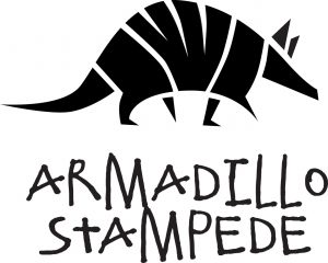
I even tried my hand at making a logo. That went… poorly. It was a disaster. So I reached out to a friend, colleague, and overall great guy, Matt (airosolonthewall). He’s a designer and is a pretty darn good one at that. He created my first logo. And I loved it.

Then… well, as is my nature, I was using the Google and came across another Armadillo logo that looked freakishly similar to mine. WTH! According to the archive.org (the internet archive), they’ve had it for quite some time. It just so happens that their designer and Matt come up with a VERY similar logo. Matt had never seen their logo before. Great minds think alike and all that.

So what the heck to do? Well, I had a couple options
- Ignore the similarities and go about with my life
- Contact Armadillo Merino and see if they’re cool with me and my logo
- Change my logo
I’m not one to ignore a problem. So #1 is out of the question. There’s absolutely no reason they should be happy with me and my logo. They are a big company. And they have videos on YouTube with their logo.
THEY SEND STUFF TO SPACE!
https://armadillomerino.com/blogs/our-story/our-story
Their equipment is no joke. They make firefighter protection gear among other things. They make serious stuff that saves lives. I make fart jokes in scifi. They could put on their fire protection clothes and drag me into an active volcano. And they’d be all comfy in their clothes while doing it! I ain’t messing with that.
Luckily, Matt is great. Matt offered to re-work my logo. Matt is awesome. Awesome enough that he came up with an even better logo! With the clapboard incorporated, it’s truly a filmmaking armadillo. Tadah

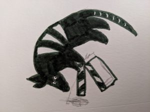
Also, some thanks to my wife/co-owner of Armadillo Stampede, Stacie. She sketched the below version when we were talking revamps with Matt.

And one final shout out. Fonts can be a real … asset… in design. #designdadjoke. The font my logo uses was drawn by a 6 year old named Elliot. Well, he used to be six. This whole time and space situation really put a damper on Elliot staying 6 years old forever. When my kid draws something amazing, it goes on the fridge. But Elliot’s dad had the sense to turn the writing into a font. So thank you Ethan at fontspring.com.


